Master Copy Challenge by Brian MacNeil
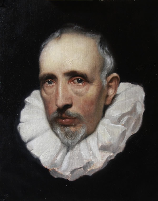
Master copies have always been a joy for me. I feel I am really able to learn the language of oil painting by trying to reproduces these amazing works. With each painting I witness may vocabulary broadening with new understanding of how the materials flow. Another benefit I’ve found with Master Copies is a new sense of design. The painters of the past, well at least the painters I look up to seem to portray there subjects with more style and vigor. For example the elegance of many Van Dyke’s portraits is experienced by the elongation of the body, more commonly noticed in the neck and hands he paints. On the other hand the artist Rembrandt designed many of his figures quit stubby and round. In Rembrandt and his many self-portraits the drawing of one is often rather different from an other.
The beautiful and amazing thing is that no matter which portrait you are looking at you know it is him. Rembrandt has a way of presenting an intimate scene were we relate and feel apart of. I once heard a story about Annigoni where a lot of his portraits didn’t look much like the sitter. The point wasn’t so much to get a photo realistic image of the persons but there essence. The part of the person that is felt and not seem by eyes. A sentiment that one feels like a memory or a dream. I believe that is why so many flocked to have there portraits done by Annigoni. They wanted to be transformed into something deeper then the way they looked.
So the importance of Master Copies is that they provide you with information that painting from life cannot. There are tricks and techniques that are not always visible in nature so one can either get real creative or look back to the masters to help us tell our stories. They teach us how to paint lips, what edges to blur, and open our eyes to see what colors are used to make a white drapery.
The Cornelis Van Der Geest has been one of my favorites since I first laid eyes on it. Even today it still gives me goose bumps looking into the gaze of it’s eyes. Every time that I am in London I go straight to the National Gallery to see it like i’m visiting an old friend. I never get tired of it. It becomes a new painting every time I study it. Often it makes me want to give up painting all together when I think about the fact that at the age of 19 Van Dyke painted this marvelous and sophisticated head.
First off i made a pencil drawing to place all the features to get familiar with the shapes and tonal relationships. I find it useful to make this drawing first because the whole time that I am drawing I am imaging my plan of attack. It may seem like an extra step but in my experience it saves me time in the long run. By the time I have brush in hand I have already painted it several times in my head working out all the kinks.
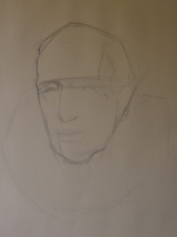
basic block-in
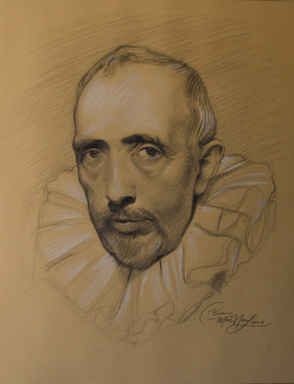
pencil drawing heightened with chalk
After I have transferred the drawing to canvas I use Raw Umber and Lead White to tone and lighten the drawing. I am in a way making a map for my self to follow later on with color. In this study this is the last time I will use Raw Umber.
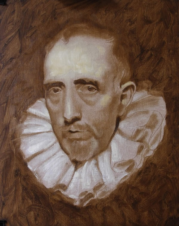
The underpainting
I left the painting to dry over night and to be economical with time I started in at the lower portion of the head letting the opaque passages of white dry a little bit longer. The colors I have chosen are limited to just Lead White, Yellow Ocher, Burnt Siena and Ivory Black. Also I am using a Sun-Thicken linseed oil medium that I have been told was used by both Rubens and Van Dyke.
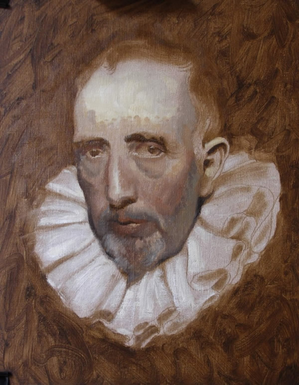
First placements of color
In this stage of the painting I have a majority of the colors and tones placed. I’ll spend the next day or so fixing the drawing and adjusting the tones and colors. I am very careful no to work too add much color to the forehead at this point. I have keyed the values lighter there with some heavy impastos. I did this because I wanted the the forehead to be of lighter value and higher chroma. To get that affect I will carefully make thin semi-opaque passes over the forehead. Modeling the forms just enough not to end up mud.
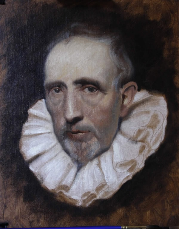
Color and tones
More correcting and modeling of small forms. The fancy brush stokes I leave out until I am confident enough that the drawing, hues and tones are relatively in the right places.
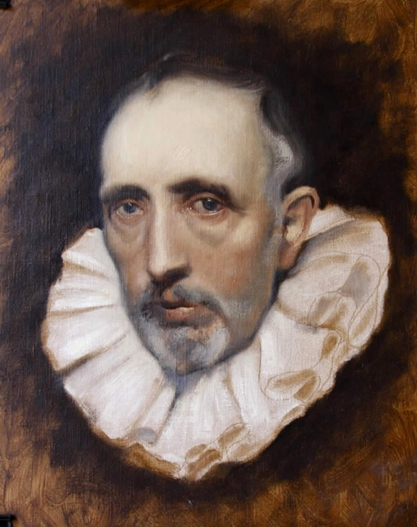
smaller forms being modeled
Now with all the guess work behind me I decided to repaint the entire head all over again. I wanted all of the strokes of paint to be painted into the one beside it. Also I was noticing that the flesh was looking a little dull and grey. I tend to like broken color and cooler flesh tones in paintings but this to me as it was lacking uniformity and life. I repainted the head and half the collar in a day. I haven’t touched it since because other paintings are taking up my time.
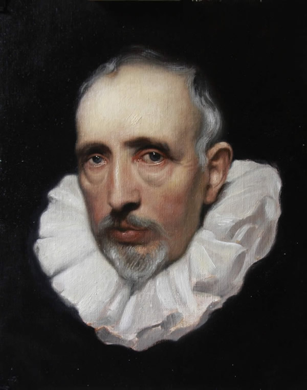
The unfinished end result
Thank you very much for viewing this work. You may check out the Pushing Pigments Blog to see other artist take on this same task. |
